Taivara Blog Post
A Better Data Visualization Tool?
Testing a customized enclosure diagram approach to data visualization

Data is a critical business asset, but the deluge of it in recent years has leaders in a variety of industries wondering how to translate it into actionable information. Data visualization tools, as a means of making sense of the huge volumes of data available, is increasingly the go-to option and was cited in two of the top five 2018 ‘big data’ trends in a recent Information Age article.
While handling huge amounts of data is a challenge for virtually all industries, it is a particular challenge, with real consequences in cyber-security and national defense. Despite a plethora of data visualization tools currently being used, security professionals often have difficulty using these common approaches to identify threats in all of the visual noise. This was the challenge faced by Taivara’s client, Cyber Reboot (an IQT lab), which they’ve described in the first of a series of articles on the topic: A Better Way to Visualize What’s on our Networks.
By the time Cyber Reboot approached us, they had made great strides in network data collection but were still struggling with ways to effectively dig into and interact with the vast amount of data available to identify threats. A better data visualization tool was clearly needed.
Need a better tool for your business?
Our designers, analysts, and engineers would love to help you dream up, design, and develop the next industry-leading solution.
A Better Way, Visualized
As Cyber Reboot considered data visualization approaches to solve their problem, they realized that the most common approach — a “force-directed graph” — was unhelpful for reasons outlined in detail in the article referenced above. While appropriate for smaller networks, these graphs become illegible when dealing with networks consisting of more than 1,000 “nodes” (aka: devices on a network, in this use-case). An “enclosure diagram” was deemed to be a possible alternative, and they identified a popular “circle packing” implementation by Mike Bostock as the desired focus of the effort. Having already come up with the design and prototype, Cyber Reboot asked Taivara to create an implementation to test the scalability of the technique. This execution allows for:
- Visualization of a minimum of 4,000 nodes with a goal of 10,000 nodes, in a browser-based application
- Seamless interactions: filtering, zooming, labeling, highlighting
- Node anchoring: Node position retains context between views
- Flexibility in supporting multiple data schema
Taivara got to work on CRviz.
The Birth of CRviz: Enclosure Diagram with Circle Packing

With the strategy and objectives well-defined (see Cyber Reboot’s 2nd article on the subject for additional details — CRviz: Scalable Design for Network Visualization) the Taivara team got to work.
We first gained some clarity by running a series of experiments:
- We experimented with using D3.js and found that it provided a lot of nice tools that help in the development of a visualization
- Node anchoring: we experimented with different layout algorithms and finally settled on a custom algorithm that retained the relative node position between different datasets
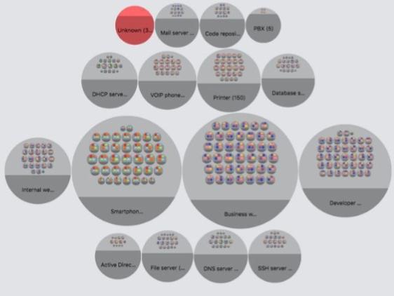
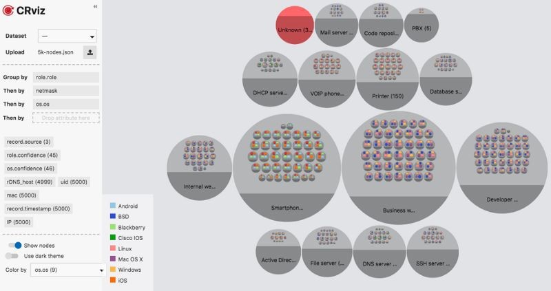
- Positions of unknown nodes: Initially, unknown nodes (which indicate potential vulnerability) are envisioned to float between the hierarchy circles. We determined that grouping them into their own highlighted circles makes them much more visible – critical to helping defenders see the potential threats
- Decluttering: through experiments, we determine that in a dataset with thousands of nodes, zooming out produces a moiré pattern that affects the look as well as the usability of the product, so we decided to implement level of details to declutter the view
- Interactions: we experimented with different kinds of user interactions, such as zooming, panning, filtering to find the right combination that balances speed and ease of use
In the implementation of node anchoring, the key insight was that “optimally using space” (as implemented by D3) and “retaining relative node positions” are conflicting ideas. In an effort to preserve space, D3’s circle packing algorithm changed the layout dramatically in response to minor changes in the dataset. The problem: it would be difficult to compare similar datasets if the layout changed every time, making use of the data visualization tool more difficult. To mitigate this, we imposed a total ordering on the circle, so that the order of all circles are fully determined ahead of time. Then, instead of a placing based on the optimal space usage, the circles are placed, without overlaps, into a grid of rows and columns. This way, the location of any given circles can be given by its coordinate, and its relative position to other circles remain the same regardless of size.
For the rest of the application, we used React, Redux, and RxJS as a framework. React is a JavaScript library that makes creating well-encapsulated and declarative views easy. Combined with Redux, a predictable state container, managing the state of the application (such as the dataset and the hierarchy controls) and passing it to the visualization written with D3 is painless. We also used RxJS and its functional reactive paradigm, to manage side effects (such as API calls). As a fan of functional programming, we also used Ramda.js as it provided many practical functional utilities to make our code cleaner and more declarative.
Given that the visualization is required to display thousands of nodes, and a smooth interaction was an explicit non-functional requirement of the project, the performance of the app is always at the forefront. The cycle of “make it work, make it right, make it fast” is much shorter than in other projects. Through constant performance profiling using Chrome DevTools, we were able to discover performance bottlenecks, in both our code and as browser quirks, and address them early-on.
The Result – CRviz Initial Release

CRviz runs in your web browser and creates “circle-packed,” hierarchical visualizations, derived from JSON-based data sets. It is a client-side application, designed to load data via basic file uploads or from a user-supplied URL. This initial version has a basic level of functionality designed to handle a few thousand nodes, but early tests indicate that it should be capable of displaying a wide variety of data sets and can scale to much larger volumes.
For all of the details, instructions, and links to access to CRViz visit Cyber Reboot’s 3rd article in their series, CRviz: Initial Release.
Other Possibilities???
This release has proven the utility of an enclosure diagram approach to data visualization and future iterations are in process to include more functionality. In order to prioritize future development, Cyber Reboot is asking for your help in testing this data visualization tool using datasets of interest to you and would like to receive your feedback — please provide it via the articles referenced above or send it to us directly at hello@taivara.com. If you could use a helping hand in testing the utility of this approach in your setting, please ask, as we are (obviously!) very familiar with the tool.
But there is a bigger question we’re hoping you ask yourself. In what areas are your current data analytics and business intelligence efforts letting you down?
From cyber-security to marketing and many use-cases in between, odds are good that you are sitting on mountains of data that could help you identify points of strength, weakness and competitive advantage if you could make better sense of what the data is trying to show you. Are you making full use of the data available to you?
If, like Cyber Reboot, you are open to trying new approaches to solving old problems, please get in touch. The designers, analysts, and engineers at Taivara would love to help.
